I was tasked with redesigning the PiCortex webapp to remove roadblocks from decision making and action in the digital business management experience for African business people.
PiCortex 101:
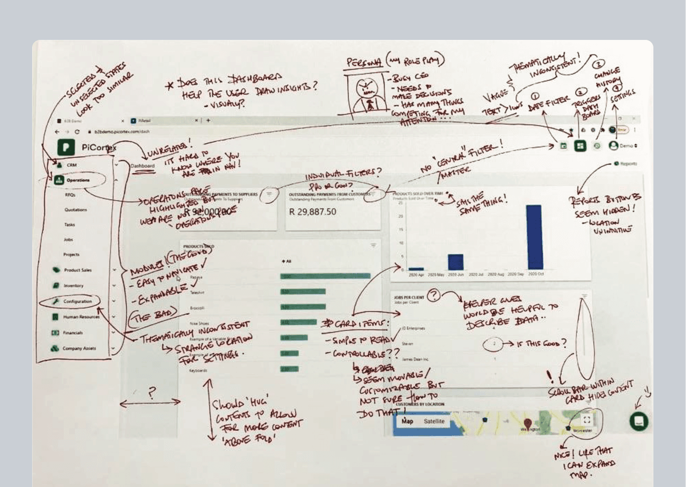
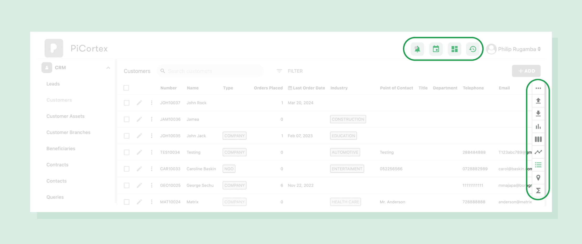
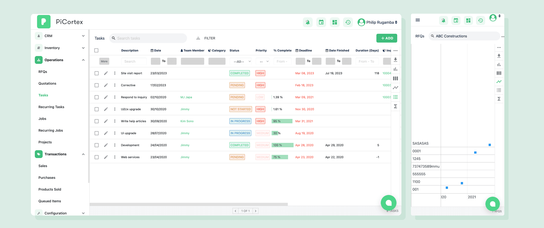
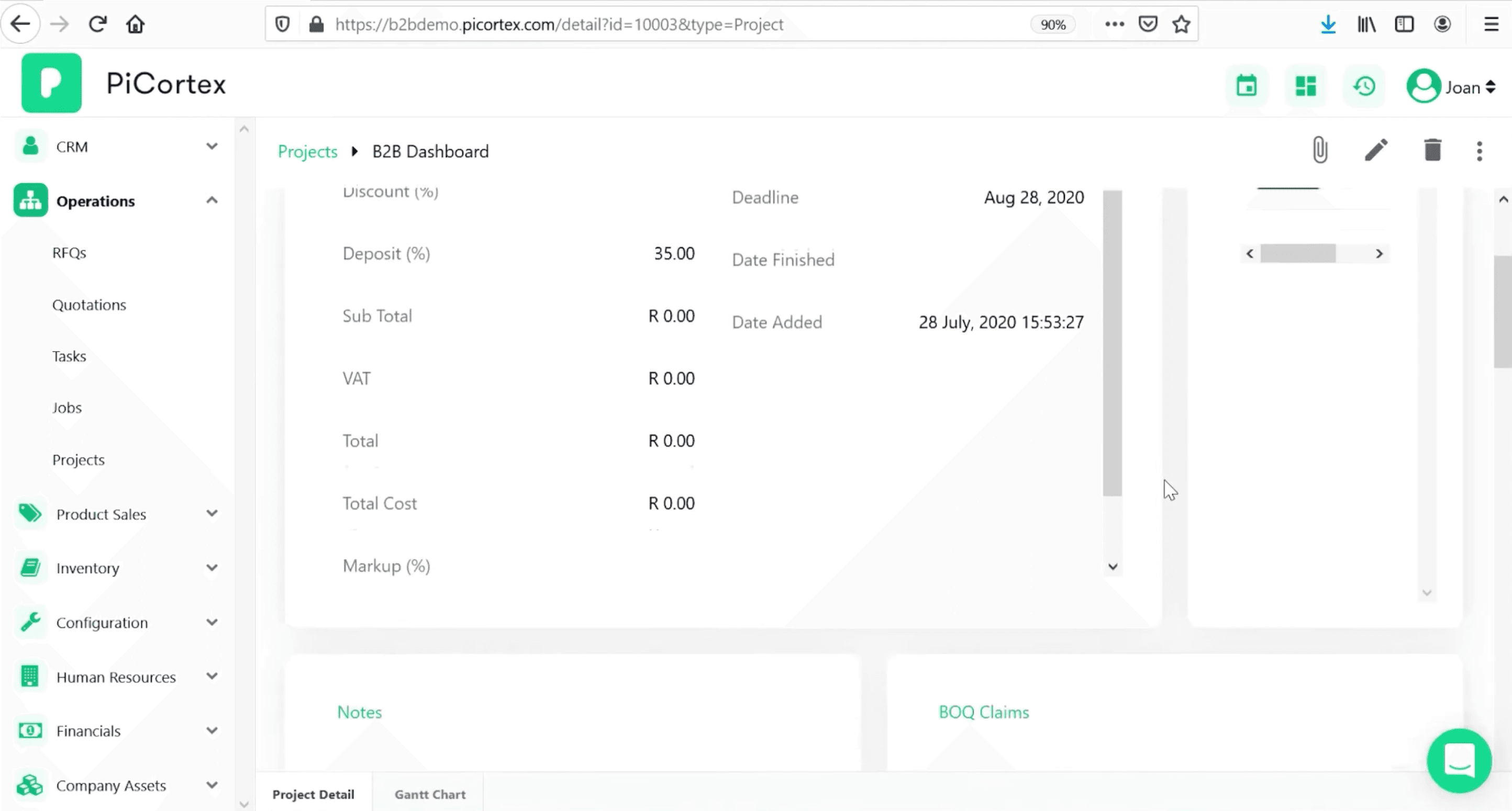
When I joined PiCortex, we had 8 businesses using our platform. While they loved what we were trying to do - be their digital CFO - they were drowning in complexity. Our support team was overwhelmed with basic questions, and our development was moving at a snail's pace. Below is the web-app I inherited:
Key Challenges to solve:
Interface was confusing and hard to navigate
Everything required desktop access
Features were complex with poor discoverability
Growing team of developers were implementing features inconsistently
"We're spending more time teaching people how to use the tool than actually using it," - Lead Customer Rep
Research
Began with a UX Audit...
Using Nielsen Norman Group heuristics as our guide, I conducted a thorough evaluation of the existing interface. Printing key pages and reviewing them with a pen facilitated easier issue identification and scoring.
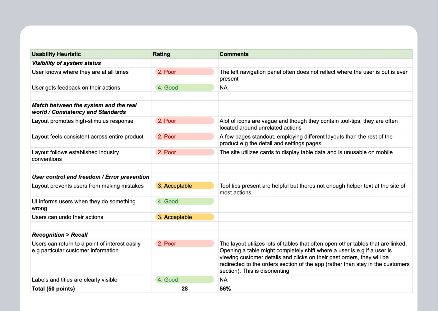
Revealing Three Core Issues…
Vague and unintuitive action groupings made navigation difficu
Detail pages overwhelmed users with excessive tables and side scrolling
Non-responsive design restricted users to desktop-only access
Talking to customers revealed…
That understanding our users’ digital comfort zones was key to increasing adoption. By observing their habits, I found that email and chat messaging apps dominated their daily routines.
It also became clear that adapting proven design patterns from platforms like Xero, QuickBooks, and Wave could help meet the specific needs of the African market.
Design Principles
To support with decision making through the design phase, we formulated the following principles to keep us grounded to the mission:
🦮 Familiarity: Can the user navigate even though they have never been here before?
🎯 Focus: Does this detract from the users goal by introducing unnecessary complexity or distractions?
🏇🏾 Proficiency: Are we enabling the user to execute tasks quicker with increased usage?
Final Design solution
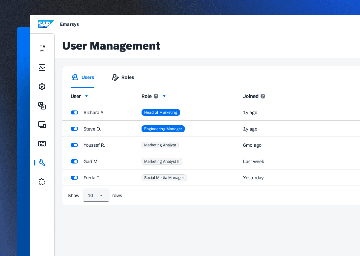
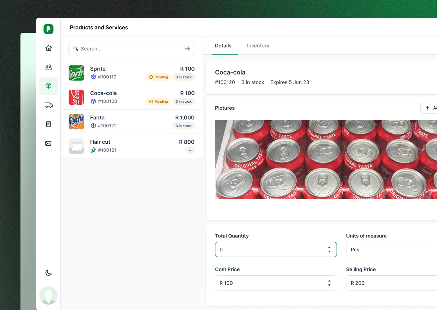
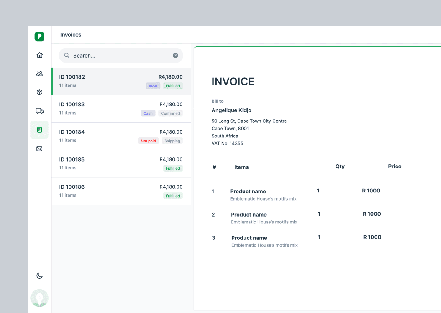
1) Messaging-Inspired Layout I explored several layout options, ultimately choosing a parent-child format commonly used in messaging apps. This was a significant departure from our old table-heavy design.
Before…
After…
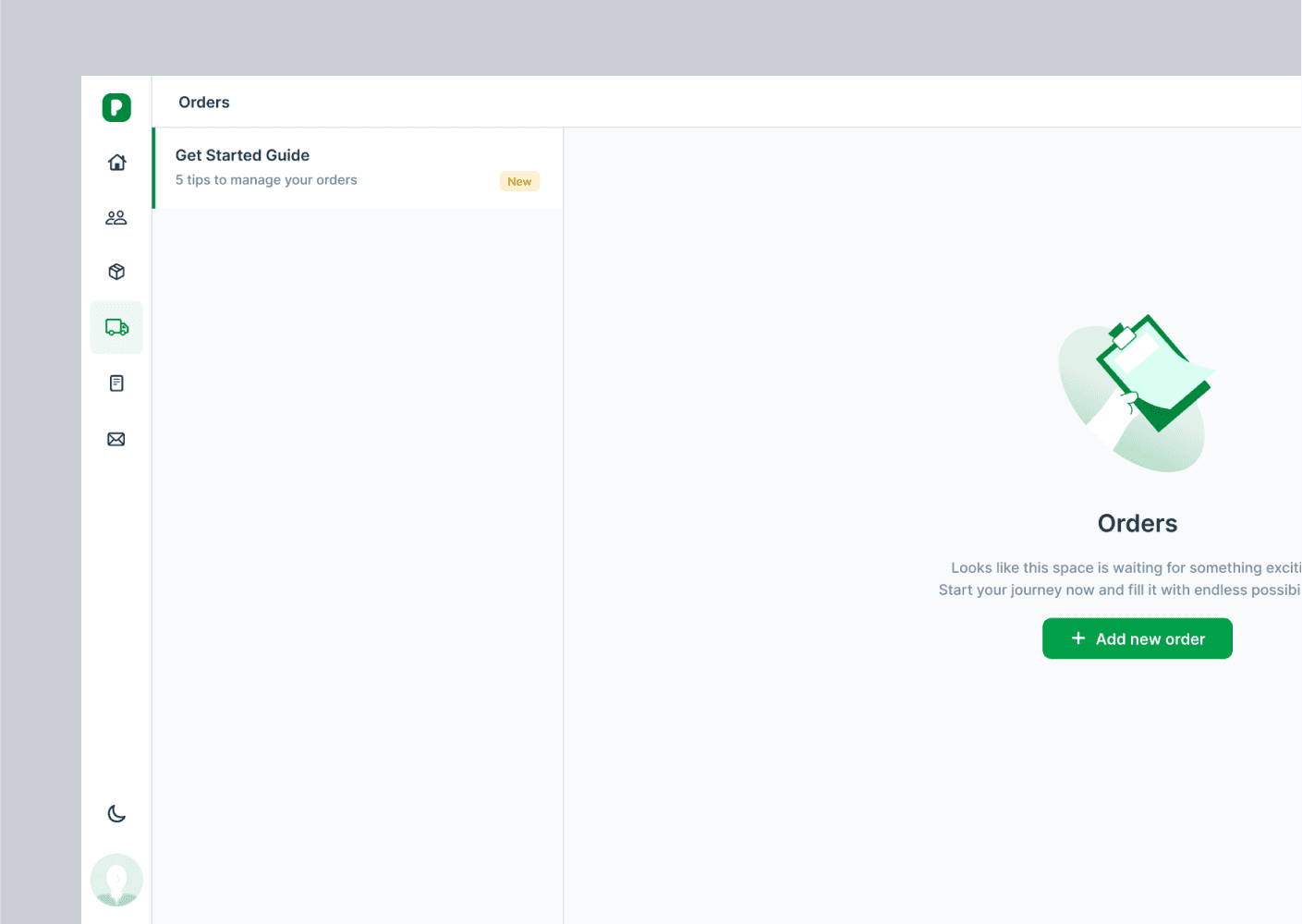
2) Empty States as Teaching Tools I transformed blank screens from dead ends into opportunities. Each empty state now included:
Contextual guidance about the feature
Clear next steps for users
Cheerful illustrations that made the interface feel more approachable
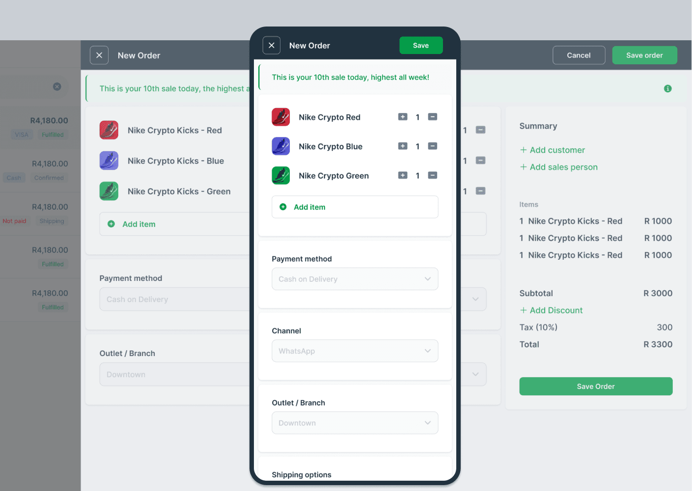
3) Responsive Forms That Feel Like Conversations: A significant portion of user activities involved data entry or viewing details. We reimagined this experience by:
Implementing side-loading modals that maintained context
Simplifying interfaces by focusing critical elements and insights
Making forms mirror their final view states, creating a more intuitive experience
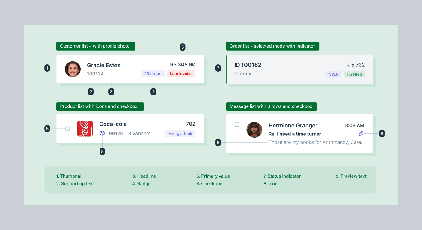
4) Lists That Adapt To Your Needs: We designed a core list component that could:
Toggle between list and table views based on data type
Adapt to different content types while maintaining consistency
Display complex data in an easily scannable format
Impact
Faster Builds:
"We're seeing new modules rolled out in like half the time compared to our previous workflow, thanks to the speed and consistency of what we are now calling "Bitframe” (the unified design system) provides . It's a turbo button on our development pipeline."
Sajja, Lead Developer @PiCortex
Less troubleshooting:
"While I'm still on the frontlines addressing customer queries, the nature of these interactions has shifted. We're no longer bogged down by basic usability questions. Instead, we're tackling more complex technical challenges, like unraveling the mysteries of missing data or squashing peculiar bugs.”
MJ, CEO @PiCortex
The redesign also set the stage for a community-driven ecosystem. Our next venture, PiMonitor, promises to further our mission of making business management more social.
Learnings
Building PiCortex's web application taught me invaluable lessons across three key areas:
Design Systems at Scale Creating hundreds of components pushed me to think systematically about design architecture. Moving from isolated component design to a holistic system changed how I approach complex interfaces, balancing flexibility with consistency.
Tool Evolution The shift from Adobe XD to Figma revolutionized our team's collaboration. Real-time features transformed design reviews from static presentations into dynamic discussions, fundamentally reshaping our workflow.
Developer-Designer Synergy Our "jam sessions" emerged as the project's breakthrough. These workshops combined live Figma reviews, video walkthroughs, and browser developer tools to create a fluid design-development process. By understanding technical constraints early, we created designs that were both visually compelling and implementation-ready.